Showing posts with label Home Staging. Show all posts

Monday, 25 July 2011

This is why you hire a stager.

I was going to call this post 'This is why you hire a stager - the WTF were you thinking edition' but decided not to for obvious reasons, but read on and you'll understand where I'm going with this post.

If you haven't already figured it out yet, I hate-on with real estate agents that don't do everything they can to sell their client's homes. I'm far from being a real estate professional (I doubt that reading a couple chapters from a real estate training guide counts), but I thought it was their job to say "Mr. Brown, your house is a dive. Before we list it you need to clean it and possibly fix some of the crap that's broken." Maybe I'm wrong. Hmm.

Case in point this residence that I stumbled across on MLS.
It's cute, but it's tired. It needs some paint, some potted plants of appreciation, some patch work on the driveway and the random dead plants in the front pulled out. Seriously, if you were driving by on a Sunday afternoon and saw this joint would you even stop? Yah, probably not. It kind of looks like one of those scary houses where scary things take place.

Entering into the home, it doesn't get much better.

Okay, so I understand that when you and your partner choose to have kids that they have a lot of stuff and that it takes up a lot of room. That said, if I'm a young, hip urbanite (not really) and I'm looking for my first home, this is not the picture that I want to see when flipping through your listing. Okay, so this picture shows me that the living room has hardwood floors and room for a TV, but why did the agent focus on showing all the clutter?

Had it been me, or the homeowner taking the picture I would have, even if only for a few minutes thrown everything baby related out of the room to take my shots. To end up with something like this -
Living room before being professionally home staged
It's not fancy, and perhaps not what I'd personally do it my own home, but it looks fresh, spacious and appealing to any potential buyer (even those who are in the same boat have will be filling the home with their own baby stuff.

Back to our current abode, let's wander into the kitchen. Fresh! Clean! Neat, uncluttered and full of character....or not.
This space actually has some potential but it's hard to see. IT's covered and obscured by phone lists, dirty dishes, fridge magnets, travel mugs, potholders and general kitchen clutter. Does this space make me want to pull out my cookbooks and whip up a feast for friends and family. Not really. Rather, this space makes me want to pull out a couple of empty cardboard boxes, a can of melamine paint for the cabinets and a jug of bleach. Yummy.
Again, the key to selling a space is to have it looking neat, organized and fresh. I know that I use the word fresh over and over and over again, but I want to look at a picture and believe that the space is FRESH. That it doesn't smell like food that's going bad or old coffee or burnt Kraft Dinner. I want it too look like this - 
http://michaelpenneystyle.com

This kitchen isn't brand new - but it looks amazing! It's clean, well staged and evokes thoughts of spending the afternoon baking a cake or of doing the dishes whilst listening to birds sing outside (okay...maybe no dish doing for this boy), but when I look at the above kitchen and compare it to the one in this week's residence, there really is no comparison. 


I was going to save this picture for last, but I figured that as we're going through this space, we may as well get the scariness out of the way. Let's check out this bathroom, fit for a - trucker?
Eww. That's all I have to say. There's nothing spa-like or serene about this space. What the hell were the homeowners and the real estate agent thinking when they took this picture? I'm not even going to talk about this how ugly this space is. They say a picture is worth a thousand words. Well, if we're looking at this bathroom, I'd say that this picture is worth a couple thousand words - at least. All I'm going to say is that they could have cleaned the toilet....


And last but not least, the master suite. Peaceful. Serene. The perfect place to escape to after a long day at work and running around. Or not.
How do you even get out of the bed on the one side? Also, with that crib in front of the bookcase  / dresser how do you access your clothes? I'm getting claustrophobic just looking at this space. When I'm looking at a bedroom, any home, I want to see a warm and inviting space where I can actually see the floor and climb into the bed from either side.

So all in all, what do I think of this home and the pictures that the real estate agent is using to try to sell this to you, me and everyone else checking it out online and (*shudder) in person?
I wish that I could have words with everyone involved in the sale of this home. Believe me, they wouldn't have been friendly words.


And that's how I feel.

That is all.
D-

Monday, 27 June 2011

This is why you hire a stager (or fire your real estate agent).

I have a treat for you!

Remember last week when I was checking out the MLS listings and came across what seemed at the time like it may have been the scariest house ever? Granny's gone wild? Yup. That one. Well my friends, I think that I may have found a place that tops that one.

But before we begin, I feel the need to rant a bit. While I love finding the ugliest of ugly spaces to share with you, I feel like I've got a bit of a beef with the real estate agents that are choosing to post these pictures. Obviously, not every home that gets posted is going to chic and put together, but seriously....dirty dishes in the sink? Messy table? Unmade beds? Come onnnnnnnnnnnnnnn!

Isn't it the real estate agent's job to make a place look as good as it possibly can before listing the property? Isn't it their job to tell you to clean up a bit....hide the strange family photos, stash your collections that might be less than tasteful, tell your teenage son to take down his Jessica Alba (or whoever it is that teenage boys fantasize about) posters? Isn't that why they get paid the big bucks when they finally make the sale?

I don't know who the agent is for the following place, but all I have to say is -


Anyways, without further rambling, I present to you the ugliest (or maybe the second ugliest) house that I've seen (in the past week). Let's start with the lovely, bright, clean and fresh looking kitchen....or not -


Dirty dishes? Seriously? Dollar store blind too small for the window? Where to begin?


Is it the dining room? The home office? The library? The storage room? Don't even get me started on the faux rock walls and wicker corner cabinet....


Not even Barbie has this much pink going on in her dream house.


I don't know what's a worse cardinal sin of decorating - the pictures hung way too high, the peeling paint on the door, the scary wood panelling or the dead plant hanging out by the TV? You pick!


Lastly, we've got the living room...which feels even tinier when you decide to cover the front door access with a giant chair. I'm not going to comment on the picture frame which is high enough up that only Michael Jordan (he plays basketball right?) can see the shots. Let alone the fact that it's ugly.

Oye.

I'm thinking that it's time to start rethinking this whole buyer gig. The world needs guys like me to tell people just how ugly their places are and then work with them to make them as attractive as possible for resale. Something to think about!

D-
Thursday, 23 June 2011

This is why you hire a stager (or someone with a bulldozer)

You know that old saying "if you don't have anything nice to say, don't say anything at all?" Sometimes when I'm checking out real estate listings I'll stumble across a space that's scary enough that it's almost impossible for even me to find something positive to say. It's just that ugly folks.

I feel like I should warn you about how bad this place looks. Maybe something a bit like this -


I'm pretty sure that someone's delightfully wonderful granny lived in this home before it was listed. That said, before listing, somebody should have stepped in and told granny and her family that she'd probably bank a lot more coin if she cleared out, well, everything.

Without further rambling, I present to you, one of the scariest spaces that I've seen in recent history -


I


I really have no words to say. I can vaguely visualize how this space could look like if you cleared out the scary silk flowers, the velvet paintings, terrifying bird hanging on the wall in the bedroom, the uber chic wagon wheel chandelier, the scent of garlic and moth balls....but it's still scary enough that I think that it would hurt to think about trying to transform this space. I mean, where does one start?

I say we start with a big, I mean BIG truck backed up to the front door and figure it out from there.

Oye.

What's the first thing that you'd do in this space?

D-

Thursday, 2 June 2011

This is why you hire a home stager.

I'm one of those nosey guys that likes to peruse the MLS listings on a somewhat regular basis. It's not that I have any plans to purchase a home - if anything it's just kind of fun to see how other people live, where they focus their energy and what they spend their coin on when it comes to decorating and furnishing their place. As well, I'm also the guy that likes to critique their space - regardless of whether it's nice or not, I'm bound to come up with a comment or idea or something else that I'd like to change.

Today's victim really isn't that bad, but at the same time, I'm going to show you a home that isn't fully living up to its selling potential. With a few tweaks and a couple cans of eggshell paint this place could have looked amazing...instead it's looking kind of meh.

From the outside we're not looking too bad! Nicely trimmed hedges, cut grass, clean yard, safe, but not bad exterior colours -


But enter the living room and we have a few problems...


This living room is suffering from a serious case of "no personality."  Okay, so we've got a couch, loveseat, TV, a couple of poorly hung pictures and an ugly brown feature wall. Oh and lets not forget about the red panel curtains. How is this room supposed to entice a potential homeowner? I wanna see lamps! I wanna see a coffee table, area rugs, etc. I don't care if you have to rent them, borrow them or steal them (okay don't steal). When I'm a potential buyer I want to be able to visualize myself enjoying this room. Right now this room is basically saying "we ran out of money; deal with it."


Below I have a couple of great example of family rooms that was professionally put together. By adding different furniture pieces and an area rug, the designer has worked to help potential homeowners not only visualize what they could do with their own furniture in the space, but they've helped to draw the viewer's eyes upwards with the air work and by placing the flat screen higher up. As well, you can quickly see how it's the little things like the candle sticks, vases and throw pillows that have helped tie the space together.

http://www.decorpad.com/
Next, let's take a stroll into the kitchen. For a home that I'm assuming was built in the late 80s or early 90s, the kitchen looks like it has held-up fairly well. It's clean, it's neat, it's boring as hell. Though I'd love to see this kitchen with the cabinets painted and drop ceiling removed, it can get pricey when you're not sure what's hiding behind the panels and grid.


For this particular project I'm going to tell these folks to keep the cabinetry as it is. However, that paint colour is doing nothing for the space. It's never a good thing when your walls and your cabinets end-up blending into one and other. I'm thinking that something like Benjamin Moore's 'Branchport Brown' would add a bit of life to this space. As far as browns are concerned, it's a good 'neutral' and will help to give the this space a bit of character.

http://www.benjaminmoore.com
Punch up the space with a few new accent pieces, some fresh white tea towels, toss in some whiteware, get rid of the nasty dollar store window treatment and you'll have a space that's worthy of showing clients.


http://www.kitchencritic.co.uk

In any home the master suite is supposed to be a call, quiet, inviting space. An escape from the real world. Someplace where an individual can come at the end of the day and feel at peace. When I caught my first glimpse of this home's master suite I got none of those feelings. If anything, this space is making me panicky and has me wondering just how many coats of paint it would take to cover that eggplant.


Nothing about this space makes me want to kick back and just relax. The furniture looks cramped and compressed into one part of the room, it's far too over-sized for the space and way too bold. I'm going to suggest a neutral pallet for the wall, classic wood tones for the furniture and bedding that doesn't look like something out of an Amsterdam brothel.


How about we start with a low bureau style dresser - with mirror hung above; heck, while we're at it, the sconces don't look bad either and would be an improvement over what are currently in the space.


http://1.bp.blogspot.com
Next, this room needs a dose of softness - both in the form of bedding and also in a bed that while still stately won't scare those coming into the space.


Perhaps a side chair with a throw on it....the perfect place to curl up at the end of the day (or to throw laundry on if your name is Dan Mitchell). Something classic, but cozy. A bit like this guy - 

http://www.decorpad.com
And lastly some light and airy nightstands to keep the space looking large.

http://www.restorationhardware.com
And while you're out shopping for pieces for the master suite, I suggest that you pick up similar pieces for the guest bedroom. Shudder (that bed frame, paint colour and duvet need to be banished - never to be seen again)...


And last but certainly not least, we have what looks like it's the master bathroom. This space has a lot going against it. A nasty colour, a wonky layout and a shower curtain with fabric suitable for something from the Liberace house of crap. Where to begin?


When you have a space like this, the best thing to do is to go neutral. Not only will it open up the space and make it feel that much larger, but it will keep the occupant from feeling like they're hanging out in Barney the Dinosaur's bathroom.  For this room, I'm going to suggest Benjamin Moore's 'Cloud White.' It's white with a bit of kick to it...it's warm and inviting as opposed to cold and stark.


When it comes to spaces like this, an individual can add colour through towels, in the form of art, etc. That said, we're trying to sell this space so we want to keep it as neutral and inviting as possible. My picks? Either white or gray towels...the softest ones that you can find. Nothing says luxury and 'spa-like' like white towels.


When it comes to accessorizing with art in a space such as this, less is definitely more. One print, photo or art piece is all you need.


And there you have it. A few more tips, suggestions and reasons as to why it's soooooooo important that you take the time to refresh your space to appeal to those who might eventually be signing on the dotted line!

D- 

Monday, 9 May 2011

And this is why you hire a home stager....

If you're anything like me, you randomly wander over to your local MLS listings from time to time to see what's for sale (or to snoop and see what your neighbour's house looks like). And if you're even more like me, regardless of how nice the rooms are appointed, you'll find something that you'd change if you were to move in.

However, there are also times when you're flipping through listings and you'll come across a home that literally has you asking out loud "what the hell were these people thinking?!?" Or better yet "weren't these people told by their estate agent that their blood red dining room and heavily paneled living room is doing nothing to showcase the home?!?"

I figured that for the fun of it, from time to time I'm going to see if I can come across 'the best of the worst'....rooms that are so bad that you can't help but want to shake your head.

Here's what I came up for this first round - 

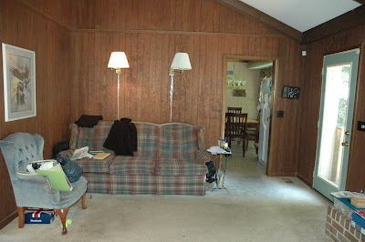
Room number one features reading lamps suitable for someone nine feet tall, a painting of an eagle and some sexy dirty paneling....homey huh?


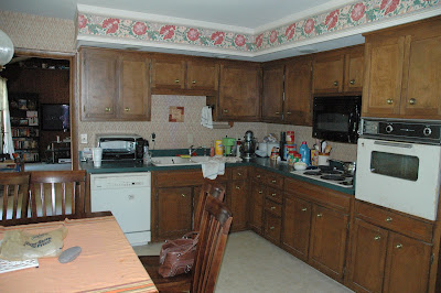
The last thing that I want to do in room number two is cook or eat. That wallpaper border is terrifying. I'm pretty sure that they're supposed to be flowers, but they kind of look like nasty scary lips. Non? That and anyone who tells you that green counter tops are a good idea needs to be slapped (just saying).


And last but not least, we have room number three.  Instant popcorn when you want it the most!? Everything about this room is wrong from the furniture colour and carpet to the couch, college dorm room lamp and brass accents. I say we open the front door and push everything out into the street. I'm all of upcycling and reusing elements of a room, but this is bad....to the power of ten.


I've seen a few spaces in need of refreshing in my time. Tell me about the worst space that you've ever seen. Or better yet, if you've got a picture, I want to see it!

D-

LinkWithin

Related Posts Plugin for WordPress, Blogger...