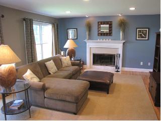
There's something that I feel the need to share with you. Something that has been bothering me for awhile and has been rolling around in my head as something that I need to talk to you folks about.
That's right. I'm talking about the cardinal sins. Or rather, my version of the cardinal sins so to speak. I present to you, my first five 'cardinal sins of decorating' -
1. Art that is hung too high or too low.
 |
| http://thedevinehome.com |
Have you ever walked into a space where you couldn't easily see what the subject or theme of the artwork was? Either because you had to look way up, or you had to bend down to see. Yah me too. I don't understand people's obsessions with haphazardly hanging pieces onto their walls. Don't you want your guests to see your pieces?
When it comes to art, I say that you want the mid-point for your piece, or pieces to be 56" from the ground. This is a perfect height for the average adult to view the piece(s) and to give a balanced feel to the wall. Any higher and your guests will have to crane upwards, any lower and your guest will have to get down on their knees.
 |
| http://3.bp.blogspot.com |
Trust me on this one.
2. Themes that take over.
 |
| http://pelangianak.com |
I like a good theme room. That said, there comes a point when people take it too far. Like the above room. You can like purple, and you can like zebra print. But please, for the love of God don't feel like you need to match everything in your room. When it comes to themes, less is more. For example, if you wanted to incorporate zebra prints into a room, I'd say pick one piece that works as your jump point - like an area rug or a side chair. From their, you can pick pieces in similar colour pallet - perhaps by adding bold black and white cushions, or using black frames or lamp shades. The below shot is a great example of how you should do a theme room.
![[ron+marvin.jpg]](https://blogger.googleusercontent.com/img/b/R29vZ2xl/AVvXsEhm11S1Zi7ANDsaOroWY5yP4GqpRcm_MFzyxlzauGmcOYu_1Nh8y7hWkbLy1KQP0wgtu4gv3-r0FIQi_6bgi9MgGPftt0pk3QGLiQotvOhdIJb-JkgwLNresA0cRGbb6mGSLTe1i67Up4o/s1600/ron+marvin.jpg) |
| http://4.bp.blogspot.com |
3. Flooring that is past its best before date.
 |
| http://uglyhousephotos.com |
Flooring is an expensive upgrade to any home, but believe me it is so worth it! Your floor choice serves as the basis for the your entire room design. A beautiful hardwood or even laminate choice serves as an excellent jump point for your design and only does wonders to showcase your furniture pieces.
 |
| http://www.bamboofurniture1.com |
A nasty looking shag rug is going to do nothing for your space. Even if you're starting out and can't afford new flooring options, it's better to pull up the existing nastiness to leave the original hardwood or floor boards....consider painting the floor boards in a neutral tone. Or if you're like me and live in a rental and are stuck with the nasty carpet, why not hit up the nearest big box where you can find a huge assortment of neutral sisals or sea grass carpets to cover almost everything?
 |
| http://designfabulous.files.wordpress.com |
4. Pieces that are not proportional to the size and scope of the space.
 |
| http://roomplanners.wordpress.com |
The worst thing that a person can do is fill a room with furniture that is too large for the space. Remember all of the problems that Chandler had when Joey built that giant TV stand for their apartment on Friends?
When choosing furniture, it's important to think about how the pieces will relate to the scale and scope of your room. If you have a smaller living room with lots of entry points it's probably not wise to invest in a large, overstuffed sectional (like the one above). Likewise with choosing chairs. If you've got a smaller room, why not choose a slipper side chair inside of that huge leather piece. Or, if you really want that leather piece, why not consider the 'condo' version - all the style with pared back measurements.
 |
| http://www.hgtv.ca |
The last thing that you want to do is end-up whacking your knees on entertainment stands, disrupting the flow of traffic or creating a floor plan that doesn't jive with the shape and size of the room. A great idea that I've used in the past is to draw out your room on a piece of paper and to cut out scale pieces of paper that represent the furniture that you want to go into the room. This is an awesome opportunity for you to see just how much space that couch or coffee table will actually take up.
 |
| http://www.inspirational-room-design.com |
5. Dried flowers & grasses.
 |
| http://mcgonnigle.files.wordpress.com |
I'm sorry, but I hate dried floral arrangements. I don't care if it's grasses in a tall glass vase, cattails, roses from a lover or a wreath that you spent $60.00 on at a craft show I can't stand dried arrangements. I'm willing to admit that I too was once guilty of having a tall cylindrical vase full of grass. It looked okay to begin with, but then it started to get dusty and dirty and started looking stale, dirty, dusty and downright blah.
 |
| http://craftychickscuppacoffee.blogspot.com |
Stay tuned for my next five cardinal sins of decorating!
D-
No comments:
Post a Comment