Showing posts with label Designed To Inspire. Show all posts

Monday, 5 September 2011

Sweet Sarah.

Have I ever told you how much I love Sarah Richardson?

No?

Well then, it's high time for me to share my love of Ms. Richardson and her work!
Having started out as a props stylist and set decorator, Sarah has taken the Canadian design scene by storm. The owner of a successful design firm, host of an evergrowing number of specialty programs and designer of an amazing collection of interior and exterior furniture, Ms. Richardson has become one of the faces of great Canadian design.
I love how Richardson is one of those designers that doesn't follow trends. She's not afraid to think outside the box and go with what she thinks looks good vs. what everyone else is doing. Along with her trusted design cohort Tommy Smythe, Sarah Richardson has created some of the most amazing rooms. Mixing modern and classic with found objects, custom pieces of her own design and thrift store finds, her rooms are sophisticated yet comfy, refined yet relaxed. Elegant but not inaccessible. 
This might sound funny, but there's just something about her spaces that I can identify with. Once you've had a chance to check out a few of the rooms and homes that she and her team have created you'll feel the same way. Regardless of your style, chances are there are elements that speak to you and make you want make this space your own! Not to mention the fact that I'd love to spend an afternoon wandering around with her....hitting up shops and seeing how she works - how her projects come together! Right?!

Here are a few more of my fave Sarah rooms -

Which designer or decorator do you look to for inspiration?! 

D-

Tuesday, 17 May 2011

Dan wants to move into a schoolhouse. True story.

Being the magazine junkie that I am, each month I get to see a lot of different homes. Some good, some bad and some that just make me shudder and wonder how the style editors still have their jobs. 

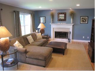
Case in point - the worst room that I've ever seen in a reputable magazine featured French toile wallpaper on the walls, ceiling, bedding and window coverings. Yup. Nasty. Remember my cardinal sins of design and letting a theme take over? Bingo! I can see toile drapery, or perhaps the side chair and some of the bedding the whole room? That seems a bit excessive....besides, who really wants to look at trippy imagery of French women in hoop skirts as they're trying to fall asleep.  not this guy.
Moving on, every once and awhile I'll come across an article showcasing a room or design style that I love. And while I'll generally clip or rip out pictures and articles that I like, sometimes I'll come across a story that I love enough that I'll stash the magazine.

One of my favourite homes was featured in Country Living a couple of years ago. Two guys purchased a 950 SQFT rundown school house in the Catskills, renovating and furnishing it for under $30,000.00.  Which still seems like a lot of money to a guy like me, but when you think about what they did it seems like a hell of a bargain.
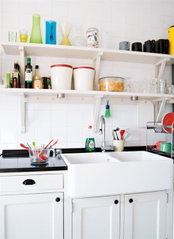
This place oozes character and whenever I'm flipping through MLS listings and come across old schoolhouse conversions for sale I think about the bright yellow door and what can be done with a space like this.
I love everything about this home's kitchen. It's the perfect mix of vintage and modern with some whimsy thrown in for good measure. Stainless steel pared with classic shaker cabinetry in an espresso tone, some kitschy travel plates and a punch of colour on the ceiling.
Here's the kitchen from another angle. The homeowners have managed to bring in an array of colours and patterns without leaving this room (and also the adjacent living room) from feeling too busy or too hodge-podgey. I'd love to work and entertain in this space!
english country house living room via cl Inside a Renovated Schoolhouse
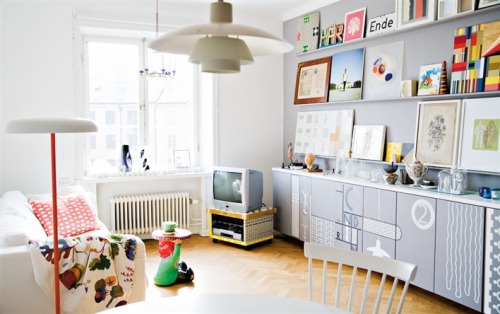
On through to the living room, you'll see a lot more of the greens and blacks that were in the kitchen - which help create a cohesive feel. The different patterns introduced help breakup the space and keep it unique. I love that they haven't been afraid to mix colour and pattern through the introduction of accent pieces like the cushions and also pieces like the antique bureau and the yellow stand. The chandelier isn't typically a piece that I'd gravitate towards, but somehow it seems to work!
green railing wallpaper via cl Inside a Renovated Schoolhouse
Leading up to the second level, the guys have created a unique gallery space and have piled on the pattern and glam. Through keeping the same base green tones throughout the space and in using patterns with a similar feel they've kept the space from looking too busy. While some might argue with me that I'm going back on or contridicting my idea of letting a theme or idea go to far I say, no way! This is the perfect balance. The railing helps break up the space and the white ceiling and floor boards help ground the space.
Flea Market Equestrian Prints RENO0407 de Inside a Renovated Schoolhouse
I'm in love with this bedroom. The cocoa brown serves as an excellent backdrop to the couple's collection of vintage art and prints. I've been on the hunt lately for unique pieces that I can incorporate into my living room and I'm all over the crest that is leaning against the wall. I've kept my eye out for a similar piece for awhile now and am hoping that eventually I'll stumble across a piece (maybe even the same piece) at Goodwill or in a box at an auction. If you're not a big fan of the brown, picture this space in something like a robin's egg blue - how great would that look?
green and yellow bedroom via cl Inside a Renovated Schoolhouse
The master bedroom introduces a soft yellow tone into the home and looks amazing! Imagine waking up each morning in that space? Notice that while the walls are yellow, that green tones once again make up the palette for accents in this room. Also - I'm green with envy over the build-in bookcases; I'd kill for something like that!
built in drawers via cl Inside a Renovated Schoolhouse
Remember the bright yellow tone on the front door? The homeowners have brought it upstairs to use on further built-in storage and I love it!
Faux Bathroom Paneling Green RENO0407 de Inside a Renovated Schoolhouse
And last but not least we have the home's bathroom. I'm a sucker for farmhouse style pedestal sinks and this my friends is no exception. While I'm currently stuck with a 70s style MDF cabinet with yellow marble top in my flat, this is what I dream of. Obviously not the most practical of solutions if you're looking for storage, but at this stage in the game I'm more focused on how great this looks and how it adds to the open feel of the space.

The homeowners have gone to great lengths to bring in personal and unique touches into the space - notice elements like the vintage paint-by-numbers and pink bedside lamps? Pieces like this only add to making a space go from being a house to turning it into a home.

While I've tried to incoporate some of the ideas shown into my own space I'm a ways off...which means one of two things. A) time to go thrifting for vintage paint-by-number kits to hang on my living room walls of B) head back to the MLS listings to see if I can find a school house for next to nothing. Hmm....

D-


Sunday, 15 May 2011

Dan's cardinal sins of decorating. Part one.

There's something that I feel the need to share with you. Something that has been bothering me for awhile and has been rolling around in my head as something that I need to talk to you folks about.

That's right. I'm talking about the cardinal sins. Or rather, my version of the cardinal sins so to speak. I present to you, my first five 'cardinal sins of decorating' - 

1. Art that is hung too high or too low.

http://thedevinehome.com
Have you ever walked into a space where you couldn't easily see what the subject or theme of the artwork was? Either because you had to look way up, or you had to bend down to see. Yah me too. I don't understand people's obsessions with haphazardly hanging pieces onto their walls. Don't you want your guests to see your pieces?

When it comes to art, I say that you want the mid-point for your piece, or pieces to be 56" from the ground. This is a perfect height for the average adult to view the piece(s) and to give a balanced feel to the wall. Any higher and your guests will have to crane upwards, any lower and your guest will have to get down on their knees. 

http://3.bp.blogspot.com
Trust me on this one.

2. Themes that take over.

http://pelangianak.com

I like a good theme room. That said, there comes a point when people take it too far. Like the above room. You can like purple, and you can like zebra print. But please, for the love of God don't feel like you need to match everything in your room. When it comes to themes, less is more. For example, if you wanted to incorporate zebra prints into a room, I'd say pick one piece that works as your jump point - like an area rug or a side chair. From their, you can pick pieces in similar colour pallet - perhaps by adding bold black and white cushions, or using black frames or lamp shades. The below shot is a great example of how you should do a theme room.


[ron+marvin.jpg]
http://4.bp.blogspot.com

3. Flooring that is past its best before date.

http://uglyhousephotos.com

Flooring is an expensive upgrade to any home, but believe me it is so worth it! Your floor choice serves as the basis for the your entire room design. A beautiful hardwood or even laminate choice serves as an excellent jump point for your design and only does wonders to showcase your furniture pieces.


http://www.bamboofurniture1.com
A nasty looking shag rug is going to do nothing for your space. Even if you're starting out and can't afford new flooring options, it's better to pull up the existing nastiness to leave the original hardwood or floor boards....consider painting the floor boards in a neutral tone. Or if you're like me and live in a rental and are stuck with the nasty carpet, why not hit up the nearest big box where you can find a huge assortment of neutral sisals or sea grass carpets to cover almost everything?

http://designfabulous.files.wordpress.com

4. Pieces that are not proportional to the size and scope of the space.

Rooms to Rave About
http://roomplanners.wordpress.com
The worst thing that a person can do is fill a room with furniture that is too large for the space. Remember all of the problems that Chandler had when Joey built that giant TV stand for their apartment on Friends

When choosing furniture, it's important to think about how the pieces will relate to the scale and scope of your room. If you have a smaller living room with lots of entry points it's probably not wise to invest in a large, overstuffed sectional (like the one above). Likewise with choosing chairs. If you've got a smaller room, why not choose a slipper side chair inside of that huge leather piece. Or, if you really want that leather piece, why not consider the 'condo' version - all the style with pared back measurements.

http://www.hgtv.ca
The last thing that you want to do is end-up whacking your knees on entertainment stands, disrupting the flow of traffic or creating a floor plan that doesn't jive with the shape and size of the room. A great idea that I've used in the past is to draw out your room on a piece of paper and to cut out scale pieces of paper that represent the furniture that you want to go into the room. This is an awesome opportunity for you to see just how much space that couch or coffee table will actually take up.

http://www.inspirational-room-design.com

5. Dried flowers & grasses.

http://mcgonnigle.files.wordpress.com

I'm sorry, but I hate dried floral arrangements. I don't care if it's grasses in a tall glass vase, cattails, roses from a lover or a wreath that you spent $60.00 on at a craft show I can't stand dried arrangements. I'm willing to admit that I too was once guilty of having a tall cylindrical vase full of grass. It looked okay to begin with, but then it started to get dusty and dirty and started looking stale, dirty, dusty and downright blah. 

http://craftychickscuppacoffee.blogspot.com

I threw it out after realizing just how stupid it looked. When it comes to the dead flowers, sheaves and cattails, I say leave them outside or in the barn. If you want greenery, spring for some cut flowers or tastefully potted plants. 

Stay tuned for my next five cardinal sins of decorating!

D-

Friday, 13 May 2011

How Swede it is.

I'm a decorating magazine junkie. I can't wait for the beginning of each month when my latest issues of Canadian House & Home and Style at Home and a slew of American decorating magazines arrive. And while these publications almost always provide me with endless ideas and inspiration, sometimes I find it fun to shake it up a bit with something a bit different. Say something with a bit more of an international feel. What am I rambling about you ask?

I've come across a number of great Australian, British and Spanish design magazines while venturing out and about. Hell, I wandered into Walmart in Puerto Vallarta this past March specifically to buy design magazines (and perhaps to see how cheap their Pacifico beer was...but that's another story). And while there are a number of great publications that I look forward to telling you about, I feel the need to share my latest discovery with you right away!

Okay, tell me that the above cover isn't just a bit inspiring. I stumbled across Sweden's very own Hus & Hem magazine yesterday and in the time since then have tried to figure out where a guy living in the middle of Canada, where the Swedish population is nil to none could pickup an actual copy to paw through.

I've loved the Scandinavian approach to decorating since receiving my first Ikea catalogue when I was a kid. The Swedes know how to do it right. They don't over think design - it's casual and clean, light and airy yet personal and cozy. Void of the stuffiness that you sometimes see in over-the-top North American decorating.

Alas, I've yet to hunt down a copy. I've called a couple of bookstores that I know that have international choices and so far no cigar. I'm going to do some digging to see if I can buy a subscription online, but until then I'll satisfy myself with the many, many pictures that I've fallen in love with.

 
Here's just a small sampling of my faves -


D-

Tuesday, 12 April 2011

Designed to inspire.

I love stumbling across good design unexpectedly.  Case in point, this afternoon I randomly came across this amazing mid-century revamp that still has me drooling.  I love the mishmash of classic meets modern...with a twist.  This home has a natural flow to it; it doesn't feel staged or overdone, which can tend to become the case when mixing and matching different design periods.  

http://www.designspongeonline.com
The openness of this entry way screams warm and inviting....plus, I'm all over the usage of vintage maps.  Case in point, my own dining room (pictures to come).  The white paneling feels fresh and clean...very casual and to me basically says "welcome, come on in, take your shoes off, stay awhile."

http://www.designspongeonline.com
The credenza above has given me hope that I too will randomly stumble across one at a garage sale this summer....how I'll get it home, I've yet to figure out.  A giant piece of furniture strapped to the roof of an Alero?!?  Hmm....Anyways, I love how this piece has been brought back to life with a fresh coat of paint and new hardware.  The bar setup screams fun!  As it stands, all of my bar ware is currently hiding behind my kitchen cabinets and is crying out for some attention.  Some nifty custom art and BAM!  Impact.  A Dan project in the making?  I think so.


As we become friends and I start to post my own shots, you'll discover that I have an unwavering love for random knickknacks and small pieces.  This love has been with me since I was a kid and it's something I just can't shake.  I blame it on my Mom.  Give your kid a couple of bucks at a garage sale and what does he do?  He ends up purchasing random vintage glasses, globes, paperweights, rickety wooden picture frames and ceramic animals...The awesome thing about the above shot is that everything looks like it belongs.  Nothing really relates, but at the same time it has a cohesive feel.  I dig it.

http://www.designspongeonline.com
I let out a bit of swooning sound when I first laid eyes on this powder room.  I have a secret love for old paint by number pictures, but haven't been brave enough to really a) indulge in purchasing them, or b) being brave enough to incorporate them into my rooms out of fear of receiving goofy looks from my guy. This shot has me feeling differently though, the mix of black frames with white matting and vintage pieces give this room a unique feel without dating it, or making it feel "too vintage."  


I'm also all over the idea of using darker colours and patterns (via wallpaper) in powder rooms.  I mean, why not?  Small space, not a huge commitment and a chance to do something a bit daring.  Speaking of which....I could totally see this tone in my own bathroom.  Yet another future Dan project?  We'll see.

-D

LinkWithin

Related Posts Plugin for WordPress, Blogger...